Anonymous and cheap: Experimenting with unobtrusive methods of measuring user experience and engagement for in-gallery interactives
Brian Hewitt, Corning Museum of Glass, USA
Abstract
Anonymously used in-gallery digital interactives may have lower barriers to visitor usage than downloaded apps, purpose-built devices, or even Web apps. But because of that anonymity—and their typical nature as single “page,” limited purpose, context-sensitive, nonlinear, or non-conversion oriented applications—they can present challenges in meaningful engagement data collection and user experience analysis. Both high-tech and low-tech tools and techniques exist, but these can be expensive, imprecise, intrusive, or time-consuming. In this paper, we examine methods and techniques to gather user experience and engagement data in inexpensive and unobtrusive ways, which we have been exploring over the course of several exhibitions and multiple installed digital interactives. The use of inexpensive security-style cameras combined with data forms geared toward rapid, simple input allows for more naturalistic observation of more visitors in less time, and for the collection of standardized, quantitative data. Programming of the interactives can include custom analytics events and rough session estimations based on user activity and idle times. These methods are not necessarily meant to be definitive but may provide alternatives where other methods are not feasible or desirable. In cases where other tools are available, combining these techniques may provide a richer picture of the overall effectiveness of installed interactives.Keywords: engagement, analytics, user experience, data
Introduction
Anonymous usage of digital interpretive applications installed in exhibitions is fairly common. This anonymous approach can remove barriers to use: no apps to download, no devices to carry, no setup or login tasks. Nothing is asked of visitors but time and attention. But that anonymity can present a problem from a user experience analysis standpoint: it can preclude clear delineation of users, page views, sessions and similar important measures.
There are important questions to be answered about the effectiveness of anonymously-used interactives. Utilization rates are needed to measure how well the applications market themselves, as are ways to understand whether visitors are engaging with the content—or why they’re not. With little or no possibility of onboarding and very little time or patience for learning to use an application, usability and comprehensibility within the context of the exhibition are critical factors.
Measuring engagement and evaluating user experience in websites, apps, and other online products is a well-trodden path, with robust and mature analytics and integrated user experience analysis tools. Google Analytics and other website or app usage tracking tools provide vast data on content views and user behaviors and flows, augmented with demographics, tools for segmented analysis, and real-time monitoring. Similarly, user experience (UX) analysis software such as HotJar and Clicktale, integrated into websites, can record mouse movements, clicks or taps, scrolling, and other rich user behavior information.
These analysis models are often rendered useless for in-gallery interactives, particularly those used to illustrate single or simple concepts in support of exhibition interpretive goals. These applications may lack multi-view or multi-page flows, navigation, or other user interface functions that normally provide insight into user behavior, efficiency, and the effectiveness of presented information.
Engaging technologies that can provide data on visitor behaviors and interaction with digital interpretive material have been employed and documented, but often rely on installed mobile applications or purpose-built devices (Baldwin & Kuriakose, 2009; Chan, 2015) to localize and track individuals and their behaviors. These systems can present hurdles of their own, including visitor uptake, cost, and complexity of implementation and maintenance.
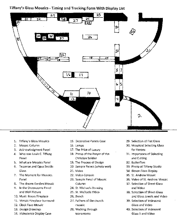
Visitor movement studies can also provide some insight into the general volume of installed digital interpretive application usage. The Corning Museum of Glass (CMoG) has, for many years, contracted low-tech “timing and tracking” observation studies in our exhibitions and galleries (Figure 1), documenting visitors’ paths, stopping points, and comments to help evaluate exhibitions, and understand visitors and the dynamics of their visits. From a user experience perspective, however, these studies often create at least as many questions as answers.
Computer vision programs may automate data collection towards these ends. These software tools can be developed to analyze video to differentiate individuals, track movements, and identify behaviors. CMoG is in the early stages of experimentation with these technologies. While such approaches may be inexpensive from a software and/or hardware perspective, they are complex to program and refine. Wi-Fi, NFC, BLE, and other location systems are promising as well (Bowman & Jaebker, 2013; Tarr, 2015), but still in their infancy and far from simple to install, configure, and program. CMoG has also begun working with Wi-Fi location services, but initial efforts suggest location accuracy may be limited to several meters at best (Cisco Systems, 2014).
All these location tracking techniques may provide useful broad-stroke information on visitor movement throughout the museum but again would likely fail to provide details for understanding user experiences with individual digital interpretive applications installed in galleries. Proximity to an installed device does not necessarily signify engagement or even evidence of usage.
There are, of course, well established low-tech user experience qualitative and quantitative analysis techniques, including one-on-one user tests, shadowing (Solis, 2017), observational studies, and visitor intercept studies. These are unlikely to be replaced, but do present challenges in available staff time, recruitment of study subjects, intrusion into visitor experiences, and the potential effect of observers on natural behavior (Draper, 2006; Interaction Design Foundation, 2017; Macefield, 2007). Paid user experience toolsets and services, such as TryMyUI and UserTesting.com do address some of these concerns. Such services are typically focused on usability or task efficiency measurement—certainly useful data, but not a naturalistic method of studying engagement in the context of an exhibition or gallery.
Universal concerns about available staff time, a change in our long-standing timing and tracking survey practices, and the nascent state of Wi-Fi location services provided a convenient rationale for experimenting with simple and inexpensive tools and techniques that could provide efficiencies and insights in our attempts to measure anonymous visitors’ engagement with our installed digital interpretive applications. CMoG’s exploratory experiments and the kinds of data they were able to produce are documented here.
Impetus
The need for exploring new, simple, systematic approaches to tracking user behavior in digital interpretive applications became particularly clear after the launch of two exhibitions in 2016 at the Corning Museum of Glass: Revealing the Invisible: The History of Glass and the Microscope, and Fragile Legacy: The Marine Invertebrate Glass Models of Leopold and Rudolf Blaschka. The former exhibition included a whole-body gestural interactive utilizing a Microsoft Kinect device, along with two touch screen digital interpretive applications based on standard Web technologies. The latter exhibition included a single, large, touch screen map, also created with standard Web technologies. The subject matter of all these interactives was narrowly focused, and all were used anonymously by visitors. In part because of their anonymous natures (and in part because of technologies and developer time constraints), none of these interactives included collection of analytics data upon initial deployment. Basic event tracking data was added to the Web technology based interactives shortly after launch, but it quickly became clear that tracking raw event data provided limited insight into usage and behavior. The plan for assessing the gestural interactive, Be Microscopic, focused on observation. This provided some anecdotal information on usability. But the exhibition’s size and its location in the museum’s library rather than galleries—which tended to suppress visitor numbers—added wrinkles to the prospect of regular unobtrusive observations.
Scope of experiments
Experiments with enhanced measurements of user engagement and behaviors have focused on the following exhibitions and their installed, anonymous-use digital interpretive materials:
Exhibition: Revealing the Invisible: The History of Glass and the Microscope
Dates: April 2016-March 2017
Digital interpretive application(s) measured:
- “Microscopes Scale Interactive”
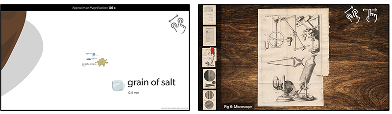
HTML/JavaScript-based touch screen interactive, exploring microscopic scale organisms via simple pinch touch gesture to zoom to smaller scales (adapted from work originally created by Genetic Science Learning Center, University of Utah) - Micrographia
HTML/JavaScript-based large touch screen interactive, allowing visitors to examine digitized pages of Robert Hooke’s richly illustrated book of microscopic observations, published in 1665
Exhibition: Fragile Legacy: The Marine Invertebrate Glass Models of Leopold and Rudolf Blaschka
Dates: May 2016-January 2017
Digital interpretive applications measured:
- “Blaschkas Around the World”
HTML/JavaScript-based touch screen map, exploring the global distribution of the Blaschkas’ marine invertebrate models

Exhibition: Tiffany’s Glass Mosaics
Dates: May 2017-January 2018
Digital interpretive applications measured:
- “Mosaic Theater”
Video room installation with touch screen control surface, built with Four Winds digital signage technology - “Last Supper mosaics”
HTML/JavaScript-based touch screen interactive, with simultaneous comparison of multiple mosaics in different locations created from the same design drawing - “Marquette mosaic”
HTML/JavaScript-based touch screen interactive, demonstrating the use of specific types of glass fragments in creating color, texture, and patterns - “The Dream Garden mosaic”
HTML/JavaScript-based touch screen interactive, demonstrating the use of specific types of glass fragments in creating color, texture, and patterns

These experiments were performed from the perspective of user experience design, not from an educational or curatorial perspective. Questions about their usefulness or accuracy may arise when these methods are examined from a broader or alternate perspective.
Defining and studying engagement
Among the challenges in exploring methods of obtaining engagement data in these narrowly focused, anonymously-used interactives is defining what the process and state of engagement means, and whether data produced provides useful – and reasonably accurate – insight. How is engagement defined in passively-consumed digital presentations when users do not choose or manipulate content, when engagement time is intended to be short, or when true engagement with digital interpretive materials requires engagement with context beyond the screen? Psychological and human computer interaction (HCI) frameworks that examine focus and engagement narrowly from standpoints of mental absorption, play, or goal orientation may fall short. The generalized definition of user engagement with technology proposed by O’Brien and Toms (2008), extrapolated from various existing psychological and HCI frameworks, proved a useful guide: “Engagement is a category of user experience characterized by attributes of challenge, positive affect, endurability, aesthetic and sensory appeal, attention, feedback, variety/novelty, inter-activity, and perceived user control.” (O’Brien & Toms, 2008)
Initial efforts: surrogate user sessions
Our first efforts at enhancing our engagement data gathering focused on ways to address the limitations of anonymous usage through existing event analytics. Raw data on the quantities of interaction events has little use for anything beyond superficial daily comparisons and trends, without the ability to associate those interactions with individual users or sessions. To that end, idle timers, used to display visual interaction prompts and/or reset displayed information, were leveraged to mimic user sessions; if no interaction events occur for a specified time, it is set to idle status and sends a session end event to Google Analytics. When in this idle state, the application sends a session start event on the first new interaction. We experimented with idle timeouts of different lengths and, while there was no one perfect option, we found that idle timers in the range of 45-90 seconds typically produced reasonable experiences and results, depending on the nature of the application and number of visitors.
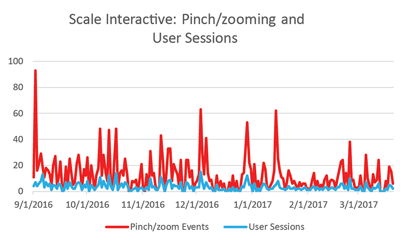
This approach provided some semblance (albeit imperfect) of individual engagement data. As an example, this technique suggested that the users of the “Microscope Scale Interactive” averaged approximately 3.7 pinch-to-zoom interactions per session (Figure 5). This was the only interaction possible in this application, and the full extent of zooming and related content could generally be reached with four or five pinch gestures. By associating raw interactions to a proxy for user sessions, the data were able to at least suggest possible examination of attributes of engagement such as interactivity/control, interest, novelty, and attention (O’Brien & Toms, 2008).
Data obtained in this way suggested that users had some understanding of the interactivity and that, on average, the content and application provided enough interest and/or novelty to propel users through a majority of the content.
The idle timer technique was also employed for the other HTML/JavaScript-based interactive in the Microscopes exhibition, Micrographia. This digital interpretive application had substantial content to browse and three interaction types: swipe to scroll through the carousel of digitized pages; tap to select a page image for viewing; and pan/zoom actions for detailed viewing. Utilizing the idle time sessions and the tap to select events, the data indicates very few sessions but an average of nearly seven pages viewed per user session, and approximately 11 pan/zoom events per user session (Figure 6). This again suggests that those few users both understood the controls and engaged with the content by selection (tap events) and closer inspection (pan/zoom events). However, occasional data glitches illuminated some uncertainty; a few documented days registered no user sessions but did register interactions. The most likely cause was short Wi-Fi dropouts, disrupting transmission of some data.

For the “Blaschkas Around the World” touch screen map, we once again employed an idle timer technique. Because this application required an active network connection to function, we did not experience data dropouts. The difference with this application was that users could explore the global map freely, not just tap the map pins for information on Blaschka collection locations. Surrogate session data suggested that only about one in three users interacted with the interpretive content (Figure 7).

This surrogate session data combined with raw event data—if accurate—suggested that users did understand the map controls and interactions, but the awareness of, or interest in, the interpretive content, fell somewhat short against the novelty of the map, the interactions, or the technology. The data provides no way to differentiate the users’ interests.
Extending experimentation: Video observations
While these initial experiments in engagement data gathering methods showed promise, they included inherent uncertainty. Foremost was the validity of the idle timer as a proxy for actual user sessions. If the idle timer expires while users were still loosely engaged with the application while reading or discussing, a new session would start on their next interaction, thus overcounting real sessions. If usage was frequent enough to not allow expiration of the idle timers, this would undercount actual user sessions.
For a following exhibition, we aimed for further—and potentially more accurate—insight into our anonymously used digital interpretive installations. For Tiffany’s Glass Mosaics, two inexpensive wide-angle power-over-ethernet 1080p color security cameras were installed on the ceilings of two of the exhibition spaces, connected to network storage. The aim was to leverage the unobtrusive nature of video footage to experiment with simple and efficient methods of analyzing user engagement with the multiple interactives. It was hoped that the video footage would provide opportunities to explore qualitative and quantitative approaches, borrowing from ethnographic practices and focusing on filling in the potential shortcomings and missing pieces from our previous approach to anonymous use analytics: we would gain access to actual user sessions, behaviors, and emotional responses.
Visitor privacy concerns were considered. Because the footage was effectively identical to standard security footage, stored temporarily, and used only for anonymous, internal statistical data gathering, no red flags were raised. Staff also explored software tools for dynamically obscuring faces of recorded subjects. One remaining action item from these experiments is developing a formal usage and retention policy for footage.
The cameras’ included software was used to schedule recordings of visitors in one hour blocks for the 2017 Labor Day weekend and following weekdays. This recording schedule was repeated in late December to allow analysis of another time of year. One overhead camera was installed in the “workshop” area of the exhibition, which included three touch screen interactives. The camera was installed in a location that allowed a clear view of most of the room, including the entrance, as well as all three screens. The other camera was installed in the Mosaic Theater, a darkened space with four large video monitors and a touch screen control surface for selecting among twelve short video montages/presentations. The darkened space required use of the camera’s monochromatic night mode, which had some limitations for differentiating visitors or attempting to ascertain emotional responses (Figure 8).

All the Tiffany interactives were also intended to include programmatic analytics data, similar to our previous efforts. We programmed the Mosaic Theater installation, implemented with Four Winds digital signage software, to track content selections in Google Analytics. This data was useful for comparing the popularity of different content elements; but because it could not be easily associated with users or sessions, and because visitors often watched content without interacting with the control surface, it was not useful for measuring user engagement. The intent for the Web technology based interactives in the Workshop area was to use similar idle time session mimicking techniques, but it quickly became clear that higher visitor volume, different visitor flows, and different interactive usage patterns in that space made it unlikely that those techniques would be reliable. Inconsistent transmission of analytics data—Wi-Fi dropouts went unnoticed because files were locally hosted—solidified the decision to explore other options.
Much of the engagement data experimentation effort for Tiffany’s Glass Mosaics focused on optimizing video observation techniques and data gathering with forms. While the footage can be (and was) used for anecdotal usability observations, a more systematic approach and larger sample sizes were desirable. Multiple observation form tools were employed, and forms underwent numerous iterations to ensure both accurate and speedy observation data entry, allowing viewing of the footage at two or three times normal speed where possible.
For our purposes, it was found that a two-pronged approach to reviewing the video provided the best mix of efficiency and utility, separating the high-volume collection of quantitative general visitation, interactive usage, and basic demographic data from more detailed tracking of individual users’ content consumption and behaviors, which tended to include more qualitative data and require closer examination.
General interactive usage versus overall visitation
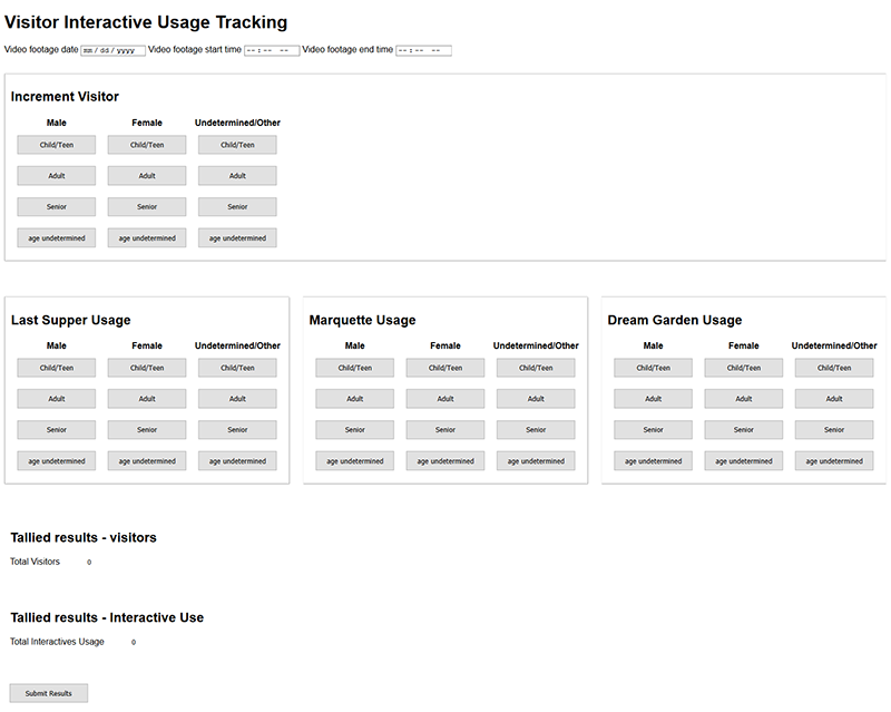
The first prong of our video observation data gathering experiments sought to address this generalized tracking need; in this case, from the perspective of understanding overall usage of digital interactives as compared to overall exhibition visitation. A simple Web form (Figure 9) was created for use while watching video footage at two to three times normal speed (depending on visitor volume), with buttons clicked to record visitors entering and using the digital interactives, sorting them into basic demographic categories. Video footage was observed in one hour blocks, and data was then submitted to Google Sheets for compilation and analysis.
This method shares some similarity with previously documented studies, such as the Melbourne Museum’s GECKOtracker (Bohnert & Zukerman, 2009), but with more focus on specific interactions, demographics, and large sample sizes, and less on visitor pathways and visualization. CMoG’s previous timing and tracking studies, as mentioned earlier, document some similar information but with much smaller sample sizes.
To test the efficiency and utility of this method, 700 visitors were observed and counted using this form. Age categories were loosely intended to correspond to CMoG’s admissions pricing categories: 17 and under, adult, and seniors (age 55+). Some subjectivity is clearly inherent in this process. Rough gender and age demographics must be inferred by the observer, and different observers may make different inferences. “Undetermined” categories are included for both age and gender, when the observer cannot reasonably guess or the visitor does not clearly fall in a category. These observations yielded a wealth of data (for example, Figure 10, Figure 11 ), although it should be noted that more granular analysis of this data (Figure 11) is more vulnerable to subjectivity errors.


While this data collection method did not provide details on actual digital interactions or behaviors, it does have the potential to provide insight into the users themselves and the overall role of the digital interactives in the exhibition.
Using this observation form, it was generally possible to observe video footage at approximately two to three times normal speed when visitation did not exceed about 100 visitors per hour, and up to two times normal speed when approaching 150 visitors per hour. Beyond this visitation rate, the number of options on an observation form like this would likely become unwieldy.
Interactive usage behaviors and content consumption
The second experimental approach to utilizing video footage for user engagement analysis was aimed at more detailed qualitative and quantitative user behavior data.
Two simple observation forms were created using Microsoft Forms. Each form was created for ease of creation and use, for simplicity of data collection and storage (directly into MS Excel, with stock visualizations of data), and to take advantage of branching logic for the most streamlined question set possible. Both forms were geared specifically towards the different experiences in the two separate exhibition spaces. Due to the volume of visitors, not all users could be observed in this manner.
Workshop interactives
“Workshop” visitors were only observed if they interacted with at least one of the digital interpretive applications and were selected randomly. As such, selection bias may impact results. The observation form for this area, used for tracking use of the three installed digital interactives, included input fields specific to use of those applications:
- Basic age and gender (as collected previously, withcategories for group usage)
- Interaction session start and end times for each interactive
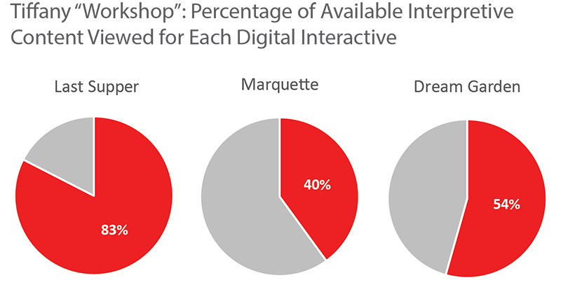
- Number of interpretive content points viewed for each interactive
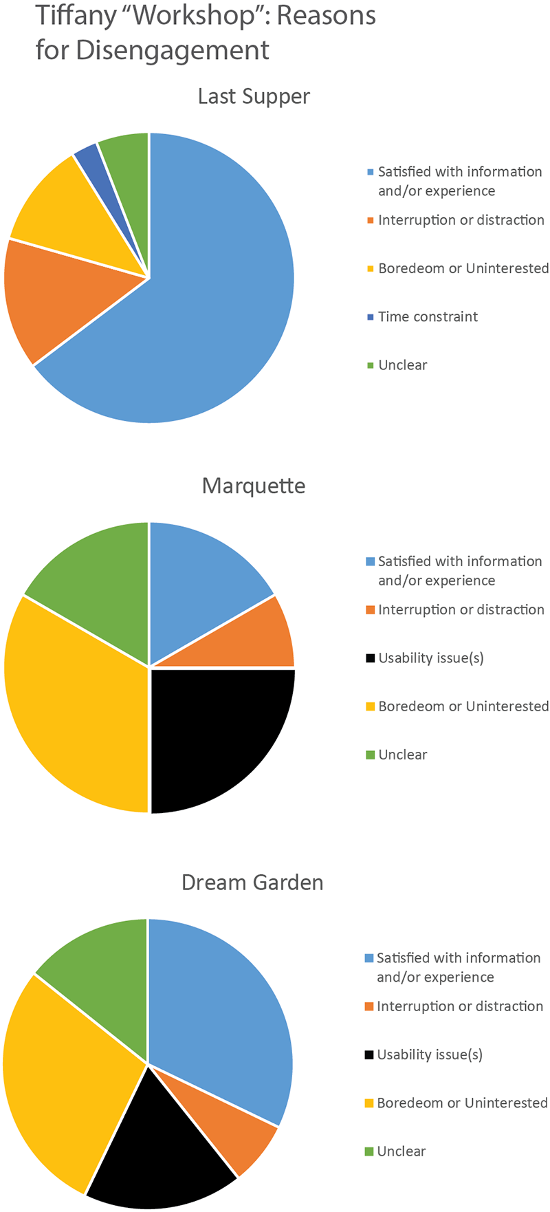
- Reason for disengagement (multiple select) for each interactive
- General notes field, for anecdotal information
As with the previous form data collection method, age and gender inferences were inherently subjective.
For these “Workshop”-area applications, interaction session start and end times were documented as the time of the first motion to touch the digital interface, and the time at which the user physically withdraws (disengages) from the device/area. Thanks in part to video time stamps and in part to the overhead angle of viewing, this timing could be determined reasonably accurately (Figure 12). The overhead view generally also provided a clear view of the screen content, which allowed counting of changing views of interpretive content (Figure 13).

This overhead view also provided an opportunity to attempt to infer the user’s reason for disengagement by observing behavior, body language or facial expressions, and interactions with others. The options included for disengagement reasons were largely informed by the O’Brien and Toms (2008) definition of the process and state of engagement. While these inferences were obviously subjective (and may be self-explanatory), they were loosely defined as follows:
- “Satisfied with information and/or experience”: user purposefully examined most or all the content and/or engaged in discussion with others about the information presented
- “Interruption or distraction”: interruption of attention by other person or activity
- “Usability issue(s)”: repeated unsuccessful attempts at interaction or visual frustration
- “Boredom or uninterested”: user quickly perused or otherwise spent little time or attention on information or application
- “Time Constraint”: summoned away before user appeared ready to depart. This category was sometimes difficult to distinguish from “interruption or distraction”
- “Unclear”: could not infer reason for disengagement or otherwise unclear
Disengagement data charts are presented here, but again, the subjective and qualitative nature of these observation should be noted (Figure 14). Information gathered this way is potentially useful, particularly in usability determination. But an intercept survey would be a better (albeit more intrusive) instrument for actual quantitative analysis.
This method of data gathering typically precluded observation of video at speeds higher than two times normal, and required periods of normal speed viewing and even occasional pauses. But it was typically possible to track more than a single user at once, with separate instances of the observation form in separate browser windows on a single monitor, with playback of video in a second monitor.
Mosaic Theater
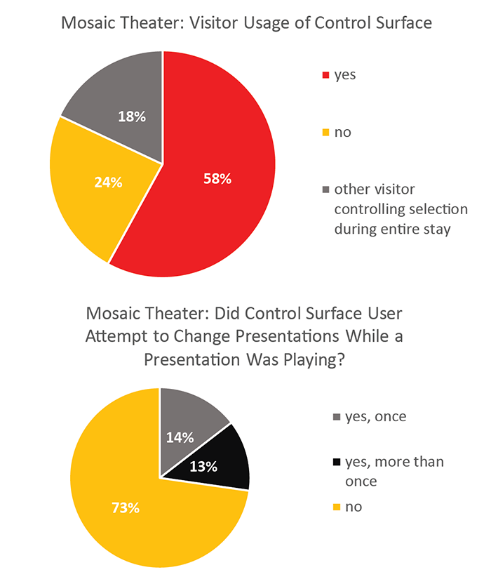
The data collection for the Mosaic Theater space was intended to measure different attributes of engagement than the “Workshop” interactives. One primary challenge in measuring engagement with this digital “interactive” from a user experience perspective was that interaction was not required for engagement. The content could be consumed passively, while others controlled the selections, making the definition of engagement less clear. We still hoped to be able to discern information about interactions with the control surface itself (Figure 17, Figure 13), but consumption of the content was a key general engagement indicator (Figure 15, Figure 16). We also attempted to answer two other questions: whether visitors understood that the video attract loop was not the real content, and whether visitors sought to stop or change the currently playing presentation (the touch screen button for this function was removed after anecdotal observations of visitors suggested it could be disruptive to the experience) (Figure 17).
The darkened space presented some challenges for identifying and tracking individuals and the content shown on-screen, which tended to require somewhat slower video observation speeds. Visitors tended to enter and leave the space in loose groups as well. Group tracking meant less individual demographic data, but was typically easier to accomplish. However, these impediments did not prevent data collection. We collected the following data for the Mosaic Theater:
- Basic age and gender (as collected previously, with the addition of categories for groups)
- Time of visitor entry into and exit from the space (when tracked as group, time of first group member entrance and last group member exit)
- Whether the attract loop or an actual video presentation was playing when they entered
- Whether the visitor used the control surface, and how many presentations they selected using it (when tracked as a group, if any member of the group used the control)
- Whether the visitor appeared to understand the control surface, and whether they attempted to stop or change presentations
- Number of short videos the visitor experienced (at least partially)
- Which presentation the visitor left during (or if they left when the monitors were on or had returned to the attract loop)
One hundred visitors were observed. Determining visitor age and gender in the darkened space proved problematic, and was likely unreliable. Other collected data points proved superfluous. Understanding of the controls, for example, was nearly universal. Time spent within the space can be measured at least as well with our standard timing and tracking studies. The presentation during which visitors left provided some information; visitors were clearly the most likely to leave during the longest video, but this observation seemed more correlated to the length of their stay than the presentation playing.


Shortcomings of these methods, techniques, and experiments
These simple, low-tech methods show promise for collection of data on anonymous user engagement with installed digital interactives—but clearly, there are shortcomings. As mentioned, using idle timers to mimic individual sessions is imperfect, and unusable with a high volume of users. Varying idle times based on visitor volume can help when visitation numbers are reasonably low. Technical problems and time constraints prevented us from comparing those idle timeout sessions against real observed user session data, so the accuracy of this method even during periods of low visitor volume is uncertain.
Data collection required substantial time, even with optimized forms and the ability to watch these videos at higher than normal speeds. Forms need to be optimized for ease of use and speed of entering data used, and need to be specifically geared toward the particular digital interpretive materials and the questions and performance indicators that can be addressed through observation. This requires some trial and error to determine what can realistically and accurately be gleaned.
If such methods and techniques are used, the role of benchmarks is an outstanding question. Can these results be used to compare digital interpretive materials from one exhibition to the next, or one institution to another? The contexts, roles, and extents of these applications varies widely.
Conclusion and next steps
These data gathering activities were done more as experiments and proofs of concept than to provide specific information on each installed digital interactive. But the results show promise, at least where other more technical methods are unavailable. The data made available from these experiments can speak to some reasonable measures of engagement, such as attention, feedback, and control. Other measures, such as meaningfulness, will likely require more traditional contact with visitors to ascertain.
Idle timers as surrogates for user sessions need verification against actual observations, but provided some engagement information on anonymous usage which would otherwise not have been available. We hope to compare the idle timer surrogate sessions with observation data in the future. We will need to ensure reliable network connections and monitor incoming data more closely. Example code is available at https://github.com/bjhewitt/idle-timer-analytics, for anyone who would like to experiment with this technique. A workable and appropriate timer length will need to be determined based on the particular application and frequency of use.
The video-based observation techniques do seem to have advantages in time saving and flexibility—footage can be watched when time allows and at higher-than-normal speeds, allowing larger sample sizes than might be possible with in-person observations. Video observations have zero impact on visitors’ time and experience in the galleries. Observation forms require little or no discussion or training to use, once created. There is almost certainly additional refinement and testing of forms and processes that could be done, particularly related to using these video observation methods during times of very high visitor volume. For anyone wishing to try similar methods, the primary challenges are likely to be determining what is possible, meaningful, and efficient to observe; and the simplest method for inputing this data into a form while observing at high speeds.
The ability to directly compare results for multiple digital interactives in the same space seems particularly encouraging. As an example, the data demonstrating high levels of attention, proportion of content viewed, and usability success of the “Last Supper” interactive, in comparison to the other “Workshop” interactives, is useful to encourage such interaction simplicity in future efforts.
There is clearly much overlap with educational measurement. It remains to be determined how we will use these techniques—and the data we’ve generated—moving forward, but they likely warrant further tests, refinement, and a broader discussion to ensure data gathered in this way is applicable across different contexts.
References
Baldwin, T. & L.T. Kuriakose. (2009). “Cheap, Accurate RFID Tracking of Museum Visitors for Personalized Content Delivery.” In J. Trant and D. Bearman (eds). Museums and the Web 2009: Proceedings. Toronto: Archives & Museum Informatics. Published March 31, 2009. Consulted January 9, 2018. http://www.archimuse.com/mw2009/papers/baldwin/baldwin.html
Bohnert, F., & I. Zukerman. (2009). “A computer-supported methodology for recording and visualising visitor behaviour in museums.” In Adjunct Proc. of the 17th Intl. Conf. on User Modeling, Adaptation, and Personalization (UMAP-09), Trento, Italy, 115-120. Consulted January 3, 2018. https://pdfs.semanticscholar.org/48a6/38978e5b0139c917226967c9e36504ea36a9.pdf
Bowman, G. & K. Jaebker. (2013). “Using Commodity Hardware as an Affordable Means to Track On-site Visitor Flow.” Museums and the Web 2013, N. Proctor & R. Cherry (eds). Silver Spring, MD: Museums and the Web. Published January 31, 2013. Consulted January 6, 2018. Available http://mw2013.museumsandtheWeb.com/paper/3817
Chan, S. (2015). “Strategies against architecture: interactive media and transformative technology at Cooper Hewitt.” MW2015: Museums and the Web 2015. Published April 6, 2015. Consulted January 8, 2018. Available http://mw2015.museumsandtheweb.com/paper/strategies-against-architecture-interactive-media-and-transformative-technology-at-cooper-hewitt
Cisco Systems. (2014). “Wi-Fi Location-Based Services 4.1 Design Guide.” Last updated January 30, 2014. Consulted January 6, 2018. Available https://www.cisco.com/c/en/us/td/docs/solutions/Enterprise/Mobility/WiFiLBS-DG.html
Coyne, N. (2010). “Ethnography in UX.” Last updated June 21, 2010. Available https://www.uxmatters.com/mt/archives/2010/06/ethnography-in-ux.php. Consulted 18 Dec. 2017.
Draper, S. W. (2006). “The Hawthorne, Pygmalion, Placebo and other effects of expectation: some notes.” Last updated May 11, 2016. Consulted January 8, 2018. Available http://www.psy.gla.ac.uk/~steve/hawth.html
Interaction Design Foundation. (2017). “Light up Your User Research–Understanding the Hawthorne Effect.” Consulted January 8, 2018. Available https://www.interaction-design.org/literature/article/light-up-your-user-research-understanding-the-hawthorne-effect ..
Macefield, R. (2007). “Usability studies and the Hawthorne Effect.” Journal of Usability Studies, 2 (3), 145-154. Available http://uxpajournal.org/wp-content/uploads/pdf/JUS_Macefield_May2007.pdf
O’Brien, H. & E. Toms. (2008). “What is user engagement? A conceptual framework for defining user engagement with technology.” Journal of the American Society for Information Science and Technology, 59 (6), 938–955.
Solis, B. (2017). “Shadowing in User Research—Do You See What They See?” The Interaction Design Foundation. Consulted September 28, 2018. Available http://www.interaction-design.org/literature/article/shadowing-in-user-research-do-you-see-what-they-see
Tarr, M. (2015). “Location, location, location! The proliferation of indoor positioning and what it means and doesn’t mean for museums.” MW2015: Museums and the Web 2015. Published January 31, 2015. Consulted January 9, 2018. Available https://mw2015.museumsandtheweb.com/paper/location-location-location-the-proliferation-of-indoor-positioning-and-what-it-means-and-doesnt-mean-for-museums
Cite as:
Hewitt, Brian. "Anonymous and cheap: Experimenting with unobtrusive methods of measuring user experience and engagement for in-gallery interactives." MW18: MW 2018. Published January 14, 2018. Consulted .
https://mw18.mwconf.org/paper/anonymous-and-cheap-experimenting-with-unobtrusive-methods-of-measuring-user-experience-and-engagement-for-in-gallery-interactives/